Case Study: Joi Freeman | Brand Futurist & Cultural Translator
The Vision
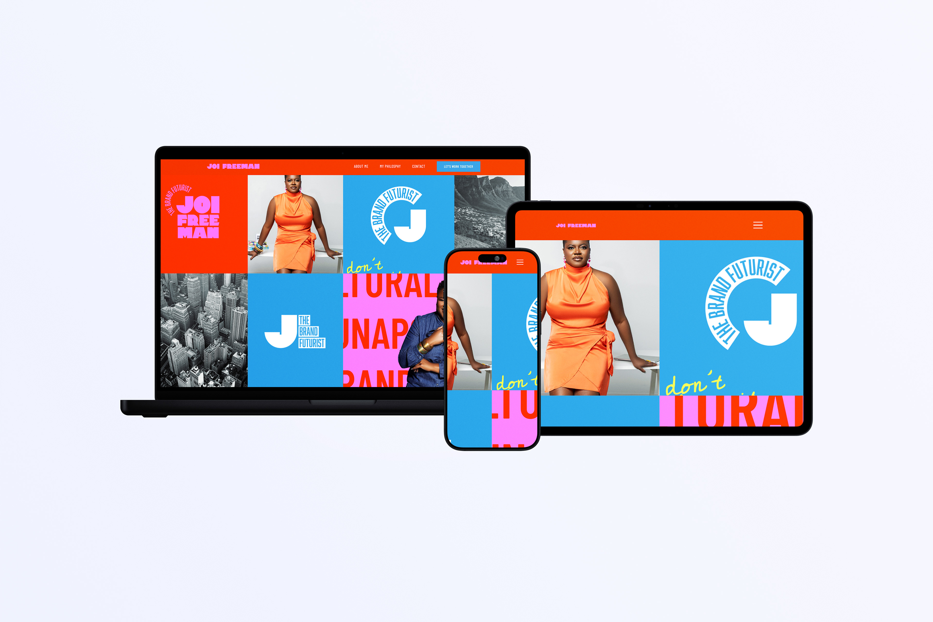
Joi Freeman operates at the high-stakes intersection of strategy, culture, and economics. As a former executive for global brands like McDonald’s and Orbitz, her digital presence needed to transcend the typical "corporate consultant" aesthetic. The goal was to build a digital home that felt as authoritative as a boardroom but as soulful as a movement.
The Challenge
Most strategy websites feel clinical, cold, and heavy with "corporate-speak." Joi’s brand is the antithesis of this—she is a "Cultural Translator" who values "real talk" over "mumbo jumbo." The design challenge was to create a visual language that signaled high-level enterprise value while remaining deeply human and down-to-earth.
www.joifreeman.com
Strategic Design Pillars
Bold Authority meets Organic Movement
We paired sophisticated, high-contrast serif typography with hand-drawn elements, like the white brushstroke arrows. This creates a visual metaphor for Joi’s work: structured strategy meeting fluid cultural shifts. It tells the user that while the thinking is rigorous, the approach is creative and alive.
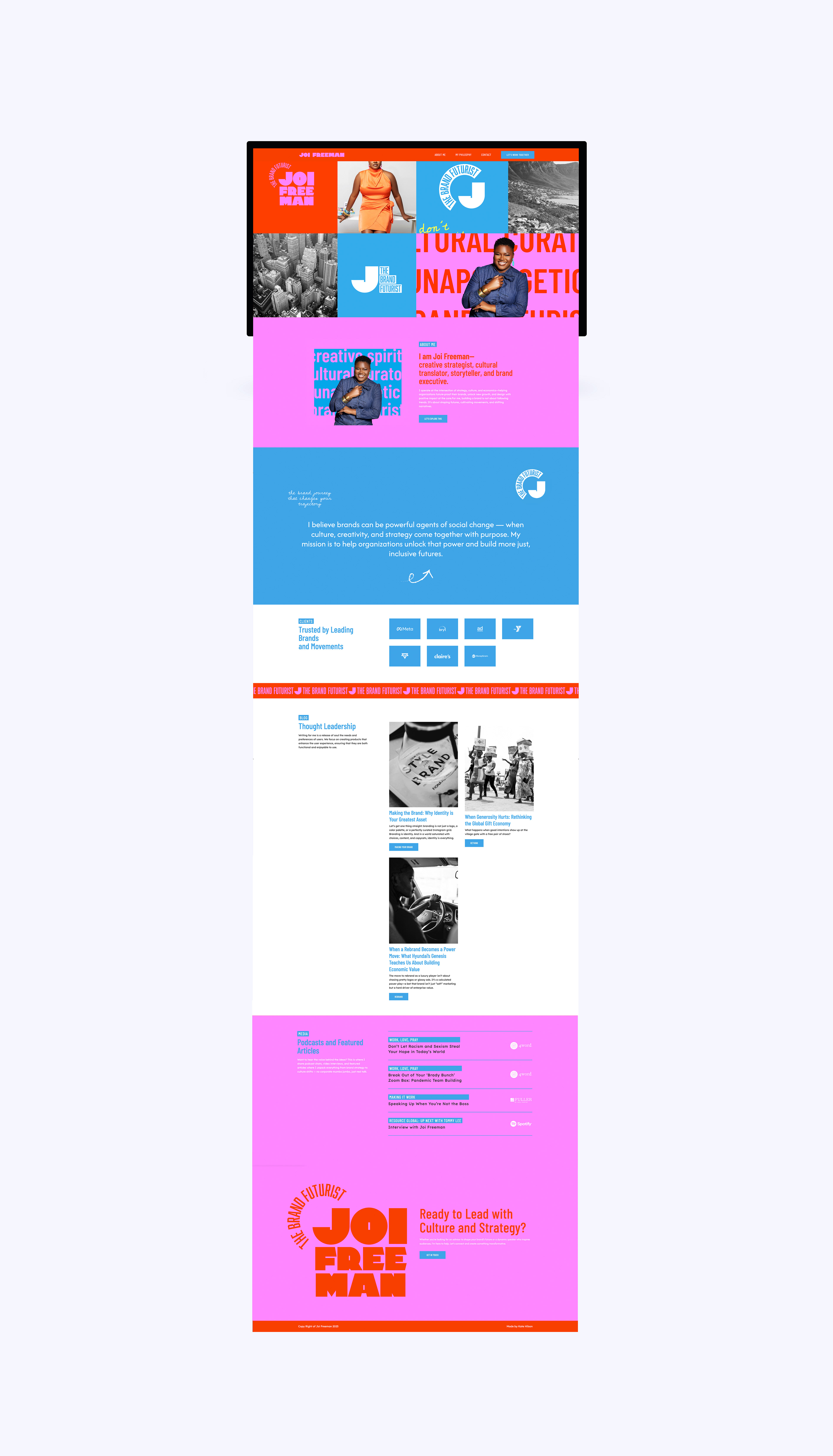
Content-First Hierarchy
Joi’s greatest asset is her perspective. We designed the Thought Leadership and Media sections to feel like a premium editorial publication. By highlighting provocative titles like "When Generosity Hurts" and "Rebrand as a Power Move," the design forces the user to engage with her intellect immediately, establishing her as a "Brand Futurist" before they even reach the contact page.
The "Anti-Corporate" Palette
Moving away from "Safe Blue" or "Tech Grey," the colour story uses warmth and depth. This supports Joi’s mission to design with "positive impact at the core." The UI feels premium and "bold" differentiating her from massive consulting firms and positioning her as a specialised, high-touch advisor.
Narrative User Experience
The site doesn’t just list services; it invites the visitor into a "Brand Journey." Through intentional use of white space and a "less-is-more" UI approach, we ensured that Joi’s voice remains the hero of the experience.
The Motion Strategy: Purposeful Parallax
In a world of static corporate sites, we used Parallax Scrolling to create a sense of "depth and discovery." This isn't just an aesthetic choice; it’s a reflection of Joi’s methodology:
Layered Storytelling: As the background moves at a different speed than the foreground, it mimics Joi’s role as a "Cultural Translator" uncovering the hidden layers of a brand’s identity that aren't visible on the surface.
Guiding the Eye: We used parallax to anchor high-impact quotes and "Brand Futurist" messaging. The subtle motion catches the user’s attention, ensuring they don't just skim past the most critical strategic pillars.
Modern Energy: The fluid motion removes the "stiffness" often found in executive consulting. It gives the site a rhythmic, living feel that aligns with Joi’s belief that brands should be "shaping futures" rather than standing still.
The Result
A digital identity that bridges the gap between the Fortune 500 boardroom and the grassroots movement. The website successfully positions Joi Freeman as a transformative leader who is professional enough to trust with a global brand, but down-to-earth enough to speak the truth.
Scope: Strategy / Web Design / Personal Branding Core Philosophy: Culture + Creativity + Strategy = Impact