Project Overview
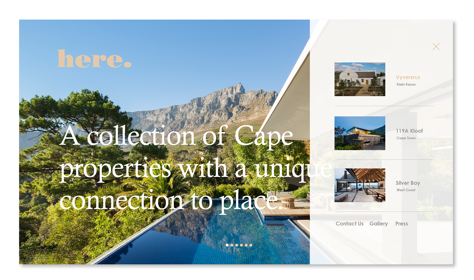
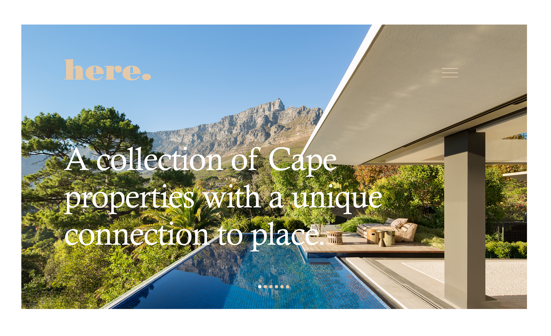
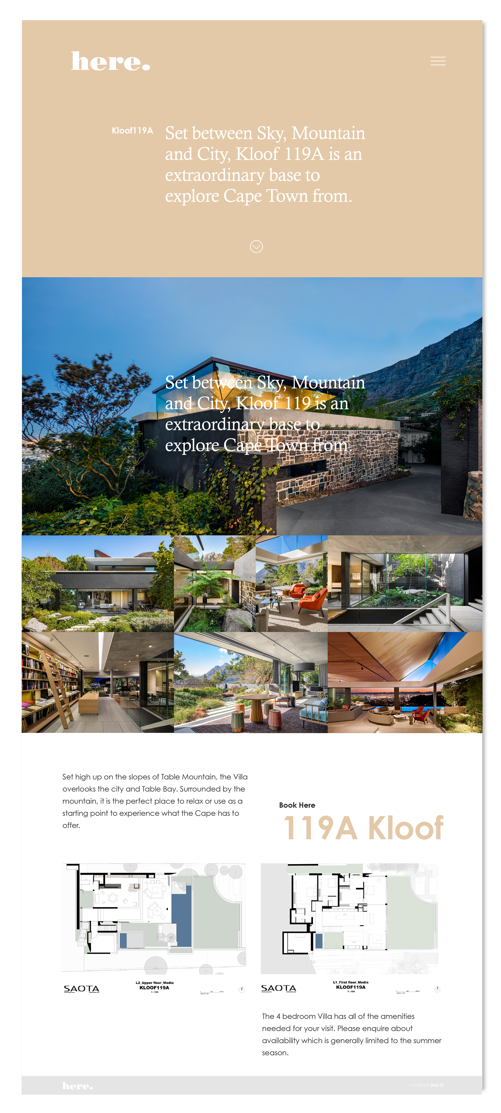
Here. is a digital showcase for high-end architecture, where the structures are the stars of the show. In this collaboration with Loud Rabbits, the objective was to create a digital environment that didn’t compete with the physical beauty of the building sites, but rather provided a silent, elegant gallery for them to inhabit.
Design Philosophy: Quiet Sophistication
The design direction for Here. was guided by the architectural principle that "less is more." We avoided loud UI elements in favor of a classic, timeless aesthetic that feels both grounded and aspirational.
A Neutral Canvas: I developed a restrained, neutral color palette specifically to act as a "blank slate." By using soft tones and ample white space, the natural textures of the stone, wood, and landscapes in the architectural photography are allowed to pop with maximum impact.
Architecture-First UX: My approach to the User Experience was to stay out of the visitor's way. I designed a navigation system that feels intuitive and "invisible," allowing users to flow through project galleries as if they were walking through the buildings themselves.
Minimalist UI: The User Interface uses fine lines, sophisticated serif typography, and a strict grid system. This structure provides a sense of stability and precision, reflecting the technical excellence of the architecture being showcased.
My Role & Collaboration
Working alongside Loud Rabbits, I led the UX and UI design phases, ensuring that the high-level brand concept translated perfectly into a functional, responsive digital experience.